Table of Contents
1. What you should know about colors
Before we go into the spring color palettes, we need to understand the importance of color in design and for all our day-to-day activities. There’s no designer on earth that will tell you they don’t use colors daily. Regardless of what they are designing, whether it’s an app or a website, everything designers will need to ensure that they find the best colors that can match what they are designing.
In addition to that, business owners also need a way to be able to utilize colors that are ideal for their brand, as well as their brand message. With that said, color is one of the most important aspects of design, and it plays a crucial role for designers and business owners.
We generally cannot undermine the importance of color, and it’s not only important for designers but for everyone. Colors have a huge cultural significance, and in addition, they can affect the mood of people.
There are two main categories of colors, and these are the cool colors and the warm colors. Warm colors are yellow, red, and orange, but it’s important to note that orange is the most neutral of these colors. These colors are mostly associated with excitement, enthusiasm, energy, and passion. Also, they are the colors that are used in depicting fire. In most cases, you’ll realize that red is usually associated with range, anger, or danger.
On the other hand, cool colors are colors that are mostly associated with nature, scenes, at night, and water. The only primary cool color is blue, while other colors are green and purple, but they both have attributes of the warm colors, which is why they are mostly referred to as secondary colors.
The amazing thing about cool colors is that they are mostly associated with spirituality, peace, abundance, and calm. Purple is sometimes associated with royalty, luxury, and wealth.
In addition to the cool colors and the warm colors, we also have natural colors, and these are colors like white, grey, brown, and black. These colors are usually used as backdrops on most websites, and in some cases, they may be combined with other colors to create more dimension.
The natural colors also have different representations. For example, black is used in representing power and mystery, but in some cases, it may be used to represent death. Grey is sometimes regarded as a depressing color, while brown as dependable and earthy. The last natural color is white, and this is a color that is mostly used by minimalist designers and the unique thing about white is its ability to make other colors to shine.
Color Terminologies
When describing colors, there are different terminologies that are widely used today, and we’ll take a brief look at some of these colors below.
- Hue: This is often used in describing colors like green, blue or red. For example, you’ll hear people say things like, “the blue is a great hue to use for your website.”
- Chroma: This is used in describing the purity of a color. Generally, when you add grey, white, or black, you are invariably reducing the chroma of the color, and this also applies to spring color palettes.
- Value of color: This refers to whether the color is dark or light. A dark color has a low value, while a light color has a high value.
- Tone: This is used in describing colors that are mixed with grey
- Shade: This is used in describing colors that are mixed with black
- Tine: Adding white to colors produces a tint.
These are terms that designers need to be aware of, especially when using spring color palettes. They will also come in handy when you are creating spring color palettes. To do this, you only need to place colors that suit each other together so that you can use these combinations on different designs, including logos and websites.
It is worth mentioning that there are also a few predefined color schemes that every designer needs to know before creating spring color palettes. These schemes include the following:
- Monochromatic Color Schemes: These are shades, tones, and tints that are derived from more direct and specific hues. They are actually the simplest color schemes, but one thing to note is that they can be different from creating.
- Analogous Color Schemes: To create these schemes, you only need to choose three colors that are next to each other, like on a 12-spoke color wheel. The colors usually have similar chroma, tones, shades, and tints, and they are used in adding interest and dimension.
- Complementary Color Schemes: This color scheme basically involves a combination of colors that are placed on the opposite ends of a color wheel. The colors usually have variations between them, and they don’t use similar chroma or brightness. Examples of combinations that you can use is red and green, which are completely opposite colors on the color wheel.
- Split Complementary: This is similar to the complementary color scheme mentioned earlier, but rather than using colors that are opposite to each other on the color wheel, you use colors that are to the right or the left of opposite colors, but it should be based on hue.
- Triadic Color Scheme: This is the last color scheme that we’ll talk about, and it utilizes colors that are spaced equally. You first choose a hue, and then every second hue on the wheel. This is a bright and vibrant color scheme, and you can also apply it to your spring color palettes.
With all that we have mentioned about colors and color schemes, you are ready to start creating your spring color palettes. Continue reading to find out how you can do this, as well as the role of photoAC in helping you with the best pictures and spring color palettes to use for your design.
2. Spring Color Palettes for your Next Design on photoAC
As mentioned earlier, photoAC will provide you with images for your spring color palettes, but you also need to understand how you can utilize these images, especially if you’re after obtaining the best. Go through these pictures below for a better understanding.
Palette 1: Plum and White-Eye
This is a palette that is inspired by the ambiance that the spring season brings, as well as its uniqueness. The picture is a representation of how the color palette is utilized, and these colors will come in handy when you use them in your brand.
For someone who likes green colors, this is an ideal palette for your design.

Palette 2: Sweet Strawberry
The next spring color palette that you might want to consider using this the sweet strawberry, and as the name suggests, it’s a color combination to use if you want to spread love, joy, and excitement during spring.
Get the mood right with this spring color palette.

Palette 3: Heavy Fruit
This is a much darker spring color palette that you might want to consider using. A blend of the color used in this color palette gives it a more natural appeal, which makes it a perfect option during spring.

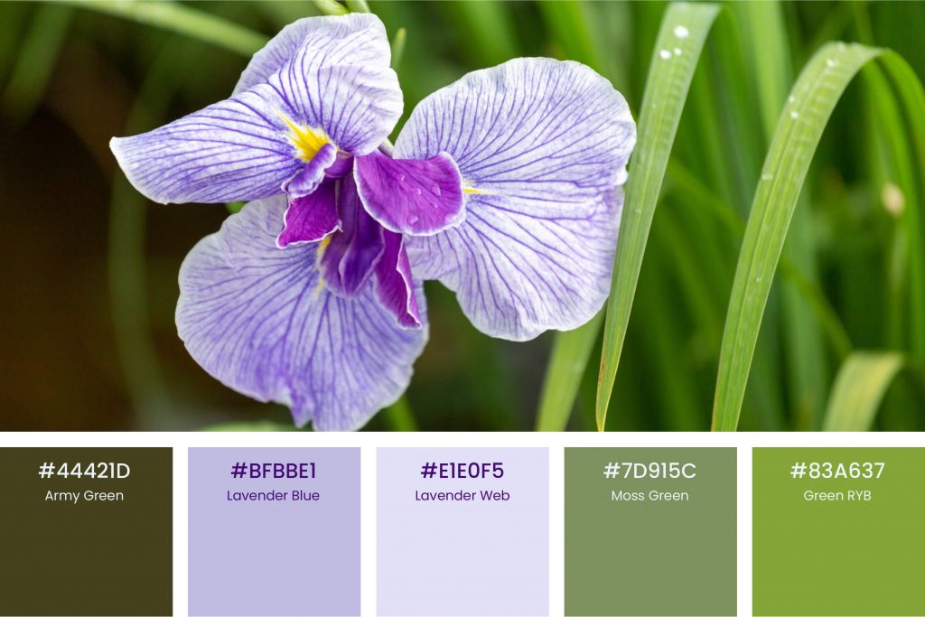
Palette 4: Iris Garden
It’s practically impossible for a spring color palette to not have green color included in it, and for this one, it has green in different shades with a purple-like color. We have mentioned the mean of green earlier to give you an idea of what each of these colors represents.

Palette 5: Gerberas Roses Carnations
The appeal that is obtained from a combination of different shades of gray is a unique one, and if you want your spring color pallets to have a feel of this kind of appeal, this is a color combination that you might want to consider using.

Palette 6: Sakura Mochi
Sakura Mochis is a color palette that you can reserve for your personal purposes, and thanks to its dark and calm appeal, and color combination, you can’t go wrong with this spring color palette.

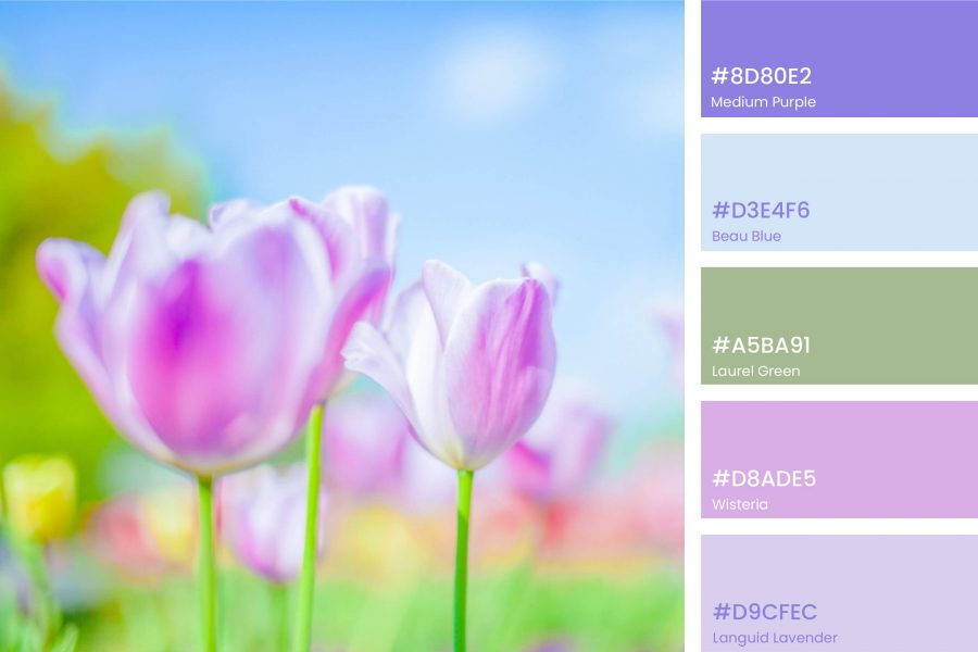
Palette 7: Tulip
If your brand is more geared towards nature, or you want a color that will give the floral appeal of a garden in during spring, this is the color palette to use.

Palette 8: Cherry Blossoms
The cherry blossoms give a different type of brown spring appeal, and it’s a color palette that will be perfect for any fashion website or design.

Palette 9: Yellow Roses
Roses and other flowers always look nice, especially when in a bouquet, mainly because of the different colors that they comprise of. If you want to get these colors implemented in your design, then you might want to consider using this palette for your design.

Palette 10: Retro Clothes
Be a little extra and dynamic by giving your design the retro vintage appeal. Whenever you look at retro clothes, you’ll notice a unique type of blend in their colors, and this is something you might want to implement in your design. Fortunately, you can easily achieve this by using this spring color palette.

These are the 10 spring color palettes that your design need, and we have made it a lot easier for you by providing the color codes of the different colors that are included in the design. In addition to these color codes, we have also provided different photographs for each palette, so you can see what your design will look like when you implement these colors.
Get your creative pen ready, and start creating the best designs for your brand, website, or logo by utilizing the spring color palettes that we have provided above.
From the colors, you’ll notice that spring colors mostly comprise of pink, orangey reds, yellows, and warm greens. These colors, when put together, are irreplaceable and effectively give the warm appeal of spring. The weather is generally warmer, which is why people spend more time outside, and you can appreciate the beauty of these colors even better.
